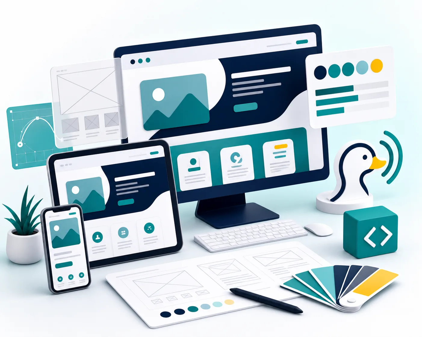
1. Say what you do without making people decode it.
A visitor should understand the business in a few seconds. Avoid vague headlines like "solutions for the future" when the real offer is website design, hosting, SEO, AI chat, or phone reception.
A useful headline combines the service with a meaningful outcome or audience. Supporting copy can then clarify the service area, typical customer, or main differentiator. This gives a first-time visitor enough context to decide whether the page is relevant without forcing every detail into one oversized headline.
2. Make the next step obvious.
The primary button should match the action the business wants: book a demo, request a quote, call now, schedule service, or get a growth plan. Do not make visitors search for the way forward.
Choose one primary action for the first screen and use a secondary action only when it serves a genuinely different visitor need. For example, "Schedule service" may be primary while a visible phone link supports urgent callers. Button wording should describe what happens after the click instead of relying on labels such as "Learn more."
3. Put trust in the first screen.
Trust can come from service area language, support promises, fast response messaging, real process clarity, testimonials, business credentials, or proof that the company understands the customer problem.
The strongest trust point is specific and verifiable. A relevant certification, a clearly stated response process, a concise customer result, or an accurate review summary is more useful than a row of vague badges. Keep the proof close to the claim or call to action it supports so visitors do not have to connect the evidence themselves.
4. Show the outcome, not just decoration.
The hero visual should help the visitor understand the offer. For DuckTele-style service businesses, that may mean websites, chat, calls, booking, SEO, hosting, reporting, or customer follow-up.
Use a real service result, product interface, completed project, team at work, or process closeup when the customer needs to inspect what they are buying. If the image is decorative, it should stay secondary to the message and should not slow the page. On mobile, crop and size the visual so the offer and primary action remain visible.
5. Keep the first screen focused.
Too many buttons, badges, widgets, or competing messages make the visitor work harder. One strong headline, one strong supporting sentence, and one clear action usually convert better.
Focus also means controlling the navigation, announcement bars, chat prompts, and cookie controls that can crowd a small screen. Review the page at common phone and desktop sizes, then remove or move anything that competes with the core decision. The first screen should introduce the journey, not contain the entire website.
6. Evaluate the first screen with real questions.
Ask someone unfamiliar with the business to view the page briefly, then explain what the company offers, who it serves, and what they would click next. Confused or inconsistent answers reveal a clarity problem faster than internal debates about individual words or colors.
After launch, compare clicks on the primary action, completed forms, qualified calls, and behavior on the next page. Traffic alone does not show whether the first screen is working. The useful signal is whether the right visitors understand the offer and continue into a meaningful contact or booking path.